Alhona is an industrial startup focused on digitizing plant processes through real-time data. I joined when the product barely existed: my mission was to define a visual, structural and scalable foundation that would allow the product to grow in an organized way. From structuring the Figma workspace to creating the Design System, I worked to ensure every design decision supported the team’s workflow and the adoption by technical users.
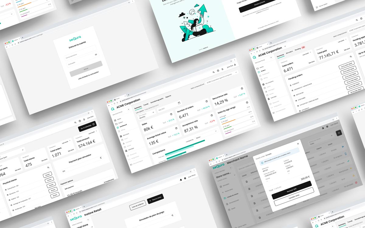
The platform combined data, rules, and technical visualizations. Designing complex screens — with dynamic tables and detailed information panels — required structuring high-density content without losing clarity. To sustain that complexity, we defined reusable patterns and tokens: visual hierarchies, modular components, and clear contracts with development that allowed us to iterate without breaking consistency.
The main focus was scalability: creating a visual foundation that could support product growth and the continuous addition of new features. Each new view was an opportunity to strengthen the system and test its real flexibility.


From day one, one of the main challenges was organizing the design environment. I structured the Figma workspace, defining conventions, hierarchies, and naming systems so that the system would be solid, shared, and scalable. Each component, page, or frame followed the same principle: anyone on the team should be able to understand it and continue the work seamlessly.

With the product still in its early stages, I developed the Design System from scratch. I defined typography, color palette, spacing, tokens, and reusable components, aligning design and development under a unified visual language.
The system became a living guide, evolving with each new feature and ensuring consistency and efficiency in interface creation.

This feature started as a simple view but soon evolved into one of the core areas of the application. Together with the product team, we iterated week by week, increasing the complexity of the model and its design options.
It was an agile process based on rapid validations and continuous feedback, allowing us to maintain visual consistency even in a constantly changing environment.


Beyond alarms and rules, the Dashboard became one of the product’s most representative areas. I designed a modular system of cards, metrics, and status components that allowed key indicators to be visualized clearly. This approach made it possible to scale the design across different resolutions and data types without losing visual hierarchy.
We validated hypotheses through quick tests with stakeholders and internal users. Figma prototypes helped us detect early issues in critical flows, especially in rule configurations and data visualizations. This continuous iteration approach improved product decision-making and strengthened collaboration between design and development.
From the beginning, I worked closely with the development team to define a scalable structure. We established a responsive foundation that ensured consistency between design and code. Clear visual documentation and constant communication enabled smooth handoffs and faithful implementation.
Although each module had different goals, the design maintained a coherent structure across the entire platform. Lists, dashboards, rules, and configuration screens shared the same principles of hierarchy, rhythm, and visual tone.


Product design: I consolidated the visual architecture, critical flows, and Figma documentation — reducing ambiguity in handoffs and speeding up deliveries.
Technical collaboration: I defined reusable components and tokens, which streamlined implementation and reduced UI-related technical debt.
Impact: The Design System enabled the launch of new views and rule modules at lower design cost and with a shorter onboarding curve for new team members.